The series covers the following:
Part 1: Layout & Design Elements
Part 2: Tags & Clean Coding
Part 3: Auditing Your Work
In Part 3 here, I will discuss ways to audit your work to ensure it meets the needs of all potential subscribers.
Handy Testing Tools
There are tools you can use to audit web pages and email builds.
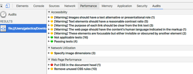
One I like to use is Google’s Accessibility Developer Tools extension for Chrome. This runs in your Inspect in Chrome and can detect areas that may need more attention. Of course, you’ll have to modify the audit based on how we build emails these days; it will detect in-line css as a performance issue:

To test linear readability, use WAI HTML Table Linearizer. Add the URL of the web version of the email, and check the results of the order of your email.
I also like the ever-reliable W3 Validator to check for unclosed tags and other syntax errors, which will round out a thorough testing sequence.
Zoom Test
You can’t predict every instance of personal computer usage, and readability is literally in the eyes of the beholder. You can, however, simulate some things, like text size. Bump your browser window zoom to 200%, and you’ll get a great visual of how your email layout performs and how your copy appears in increased size environments that are not uncommon in many demographics.
Mobile Accessibility Testing
iOS devices have a built-in VoiceOver program that can be activated in the Settings. This feature allows the mobile phone to read aloud what’s displayed on the screen. Use it to again review your hierarchy and call to action links. Also, by pinching your screen to experience your email zoomed in, you can assess whether your content is still accessible.
Make sure to check out the previous parts of the series to ensure you’ve caught all my tips for optimizing your campaigns for accessibility: Part 1, “Layout & Design Elements” and Part 2, “Tags & Clean Coding.”
By implementing these simple adjustments in your campaigns, you’re including a pool of users who have untapped potential to engage with your brand. As builders of user journeys, it’s our duty to ensure our message is reaching as many people as possible. The changes above are simple, straightforward and only enhance your campaigns.
Resources:
https://www.slideshare.net/paulairy/a-type-of-accessibility-65004974
https://www.slideshare.net/M_J_Robbins/accessibility-in-email-eoainsights
https://www.campaignmonitor.com/resources/guides/accessibility/


