

This past year, there has been lot of buzz around issues of web accessibility. In this three-part series, I’ll cover ways that email builders can address accessibility concerns. This is primarily a how-to tech series for developers, but it’s also a handy guide for marketers, enabling teams to make sure they’re providing the best possible experience for all subscribers.
The series will include the following parts:
Part 1: Layout & Design Elements
Part 2: Tags & Clean Coding
Part 3: Auditing Your Work
In Part 1 here, I will discuss email layout methods and approaches to design that can support readability:
Reading Hierarchy
Screen readers and keyboards read pages top to bottom, left to right, so consider your table <tr> layout build to allow proper reading of your copy.
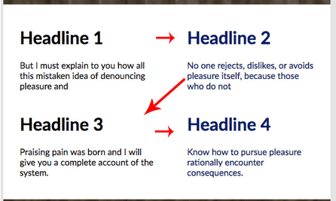
Below are examples of the same copy laid out differently in the table structure and how a screen reader would read them:
Sample A
Sample B
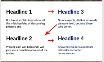
Sample A is a more logical layout because it ensures that, when presented by a screen reader, the content appears in the intended order. The Sample B layout would make it more difficult for someone using a screen reader to understand the storyline. This is particularly important in responsive builds where these columns stack 1x1 in mobile devices.
Element Hierarchy
Use html tags to create hierarchy in your email. For now, <table> structures are the leading scaffolding elements of email, but if there comes a time when tables are not needed, using <div> elements will replace tables and continue to properly structure the email build. Using role=”presentation” within your <table> tag, will eliminate the scaffolding of the table, tr, and td, and expose image elements and textual content. H1, H2, etc. are helpful defining elements that set titles and headers apart from the copy. The <p> element assists in identifying copy as well.
Images Effects and Animation
Consider users with disabilities when creating gif animations. Jarring transitions, contrasting bright colors, and glaring frames can incite responses ranging from mild annoyance to outrage. In some cases, gifs could even contribute to epileptic fits, so be careful when crafting animation. Any enhancements like hover/rollover effects should be subtle as well.
Color Contrast
Problems with seeing contrast is not a dilemma unique to those with color blindness. This problem can be brought on by poor monitors and screen resolutions, as well as varied lighting, glare, and screen sizes. Applying good contrast to your emails requires not just focusing on image design, but on your fallbacks as well. Test your email without images and make sure your alt tags read well against the background color. Make sure your fallback fonts are as readable as your first choice, especially when using thinner font weights.
Links and CTAs
Accessibility practices reinforce good habits like making links and CTAs relevant. Avoid generic copy like “Click Here”, and rather use something more descriptive of the action.
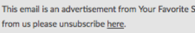
Linking only “here” is not only generic – it also confuses readers.
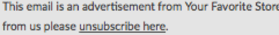
By linking the copy that describes the action, the reader can understand clearly what the link is for and why it’s there.


Which one of these CTAs allows the reader to know exactly what happens when they click on the button?
Choose Your Font Sizes Wisely
Never use fonts smaller than 14px. Copy at 11px for terms and conditions is largely unreadable in a mobile device without pinching. On the flip side, you’ll need to test large fonts not only in desktop views but in mobile as well – there are times when big is not awesome:

Here, a large font may look great in desktop, but blows out even the most reliable responsive codes in mobile screens.
Stay tuned for the next two parts in this series: Part 2, “Alt Tags & Clean Coding,” and Part 3, “Auditing Your Work.”
Resources:
https://www.slideshare.net/paulairy/a-type-of-accessibility-65004974
https://www.slideshare.net/M_J_Robbins/accessibility-in-email-eoainsights
https://www.campaignmonitor.com/resources/guides/accessibility/