This post is part of a three-part series about accessibility in email marketing. Though the posts are written with developers in mind, they contain insights that anyone on the marketing team will find useful in considering how their emails look to all subscribers.
The series will include the following parts:
Part 1: Layout & Design Elements
Part 2: Tags & Clean Coding
Part 3: Auditing Your Work
In Part 2 here, I will discuss tools that you likely already implement in your code, which can greatly increase the chances of your email being readable to people with differing needs (and, of course, on a range of devices).
The Set Up
Add lang=”en” to your <html> tag at the top. This identifies the language used in your email (English). Originally, it was used to assist search engines and browsers, but for email accessibility, it helps identify the language that will be read out loud.
Populate the <title> tag with something relevant to the campaign. Avoid leaving this blank.
Alt Tags
Alt tags are the single most important aspect when coding images in emails, as well as when coding webpages. Be mindful of populating the alt tag with relevant copy as it relates not only to the image but to the message. I see this part of the <img> tag underutilized when it should have a more prominent appearance in client reference forms. You’re thoughtful in your copy – why not extend that to your alt tags?
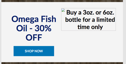
Avoid redundancy:

Instead, give a more robust presence that lets the user know something more about your product or your campaign:

Remove Title Tags
Why not also populate the title tag in the <img> tag? We remove this tag so the reader does not repeat the copy or confuse what needs to be read to identify the image.
Code Clean
In-line css is bloat in any other web build, but with email it’s a necessity. Despite the repetition that must happen for proper rendering, useless code can still occur, and a good combing of the code is beneficial for optimized performance. Scour your code for unclosed and empty tags. Repeat css in-line only where necessary. Be aware of depreciated html tags and look for css attribute options.
Ie: html tags such as <b> and <i> are depreciated, and should be replaced with stylized <span> tags (<span style=”font-weight:bold;”>).
Make sure to check out Part 1: “Layout and Design Elements”, and stay tuned for Part 3, “Auditing Your Work.”
Resources:
https://www.slideshare.net/paulairy/a-type-of-accessibility-65004974
https://www.slideshare.net/M_J_Robbins/accessibility-in-email-eoainsights
https://www.campaignmonitor.com/resources/guides/accessibility/


