

In March, marketers were thrown quite the curveball as states across the country began implementing social distancing guidelines and ordering non-essential business offices and brick-and-mortar locations to temporarily close. To help marketers adapt and lighten their load, Shaw/Scott recommends that all email marketing efforts leverage modular HTML designs.
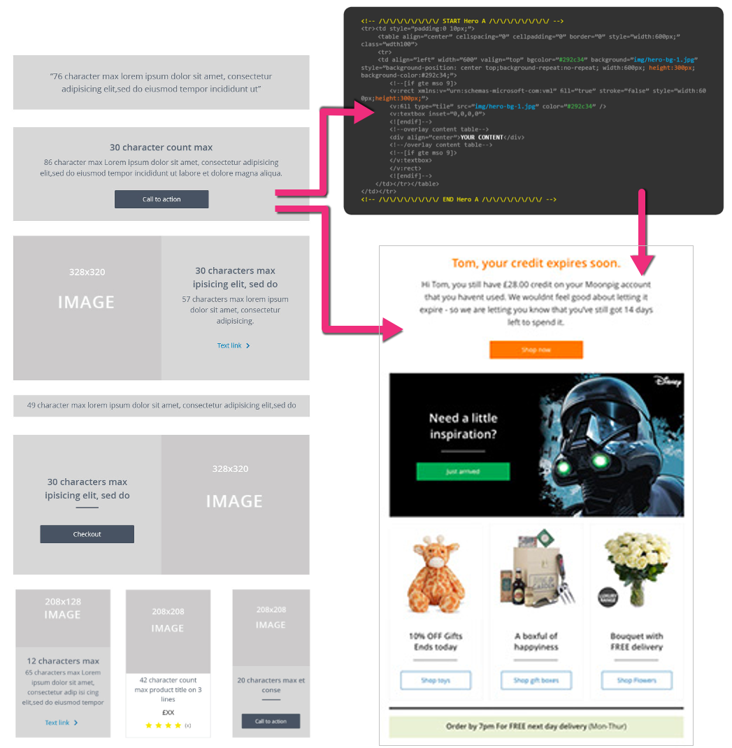
Modular design is the method of creating a system of self-contained components that can be stacked, rearranged, and used or not used, case by case. The goal is to be able to easily change or adapt individual design patterns without altering the system as a whole, making marketing more manageable.
Adopting modular design and reusable patterns into an email design workflow can easily improve the quality and consistency of your communications while speeding up your daily output.
Modular Templates
- Enhances the brand experience
- Facilitates Engagements
- Simplifies the campaign production process
- Minimizes errors
- Boost efficiency
- Improves rendering across multiple email clients
- Delivers contents on user's terms
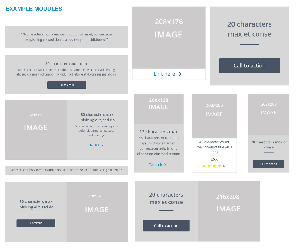
Think of a modular template as a set of Legos®. These bricks (self-contained components) are designed and coded to be removed, rearranged, and repeated, seamlessly, enabling a client to build a nearly infinite number of emails with speed and ease.
Creating a Visual Display Language
- Colors — Common colors in a design system include 1–3 primaries that represent your brand. You may want to include a range of tints—a color mixed with white. And possibly shades—a color mixed with black. This will give your designers a few more options to work with.
- Typography — Most design systems include just two fonts: 1 font for both headings and body copy, and a monospace font for code. Keep it simple to avoid overloading and confusing your user. This is not only a best practice of typographic design; it also prevents performance issues caused by excessive use of web fonts.
- Sizing and spacing — The system you use for spacing and sizing looks best when you have rhythm and balance. A 4-based scale is growing in popularity as the recommended scale due to its use in iOS and Android standards, ICO size formats, and even the standard browser font size.
- Imagery — The key to success with imagery in your visual design language is having a plan and sticking to it. Set guidelines for illustrations and icons and use the best image format for the situation.
These are just a few of the ways you can help implement modular-based email templates. Our Design and Development team have created many more examples that we can show you that, with some slight customization, perfectly represent your brand, and in turn, help lighten your workload.
To learn more about how you can successfully integrate modular email design into your email marketing program, or to request additional examples of guidelines, please reach out to our expert team at Shaw/Scott.
Are you following us on Facebook, LinkedIn, Twitter, and Instagram?