

When it comes to email marketing, the industry has seen a major boom in attention to responsive email design over the past few years—and for good reason. According to the Litmus 2016 State of Email Report, 55% of consumers are engaging with email on their mobile devices, and it’s about time we caught up with them.
Talk of responsive email is everywhere—there are even ads promoting any design delivered to your door in 30 minutes or less. Ideally, marketers should strive for future-proof responsive email templates built correctly using only media queries for progressive enhancements. If you want an email design that works hard for your brand, though, it’s often not that simple. Or, rather—it doesn’t have to be so complicated.
Wait, what? You’re not creating fully responsive future-proof emails?
To be honest, I don’t blame you. This approach can be super complex—not only do you have to figure out how to make table-based layouts responsive, which is bad enough on it’s own, but on top of that you have to learn every single nuance between different email pre-processors. There are lots of great resources to help with the knowledge gaps such as Campaign monitor and the Litmus community, but finding the time for all that research isn’t always possible or practical. The key to success lies in getting on track for thinking responsively, without all the extra effort.
Email development is difficult at best—and can be board up the windows and hide your kids-scary at it’s worst. Because there are so many limitations within different email applications, we can’t rely on fancy coding techniques to solve all our problems. Some companies may find responsive design isn’t even worth all the effort, unless of course they learn to take a step back and view the project through the lens of creativity and simplicity.
Email is a unique one-on-one communication channel between you and the user. It puts us so close to our consumers—in many cases, we are literally in their pocket. However, this proximity comes with a trade-off—our messages require that the user interrupts her day and demands a bit of her time to interact with us. I’m going to go out on a limb and say no one has ever sat down to read email like it was a good book. Which is why it’s so important that we consider a user’s time and attention in our initial planning. When we consider these elements and incorporate them into our early wireframes and sketches, it’s easy to see how overly complicated messages can really get in the way of the intended goal.
Here are a couple of practical examples of relatively simple responsive emails:
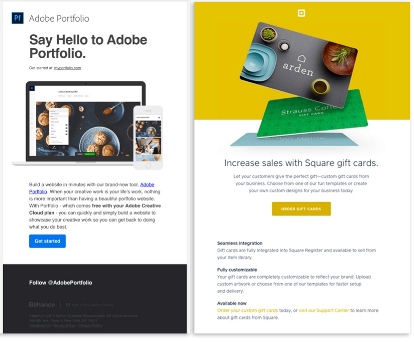 Credit: Adobe Portfolio and Square
What you’ll notice right away is that both of these emails have a lot of similarities. Each design has a very clean header area that allows the brand logo breath and frees users from the distraction of a large menu area. Both designs make use of a large hero image, bringing visual interest to the promotion. Both designs have one main copy block, followed by a strong call-to-action. Lastly, each design utilizes a one-column grid to lay out the message content. However, even given all their similarities, these two designs don’t have the same look overall. Each email has a unique identity that is specific to the brand.
The importance of this last fact should not be underestimated. Keeping email design and messaging simple doesn’t mean they have to be boring or unoriginal. Sticking to a one-column design will allow the content to stretch and shrink within the view port of individual devices. By avoiding multiple columns, you’re freeing yourself from the effort of overly complicated table structures used to reorganize content. There are a lot of great examples to be found. Website like reallygoodemails.com will help get those creative juices flowing. Just remember not to get lost—there are as many bad examples as there are good.
So there you have it: the big secret in responsive email design lies in trusting the medium, and keeping it simple. In order to make a great responsive email, start by creating a design tailored to email specifically. Email is not a beautiful full-page print ad, nor is it a fully functioning miniature version of a company website. It is its own unique animal. By designing a basic, easy-to-maintain template that honors the medium and avoids unnecessary complications, you create an easy win that does the heavy lifting for you.